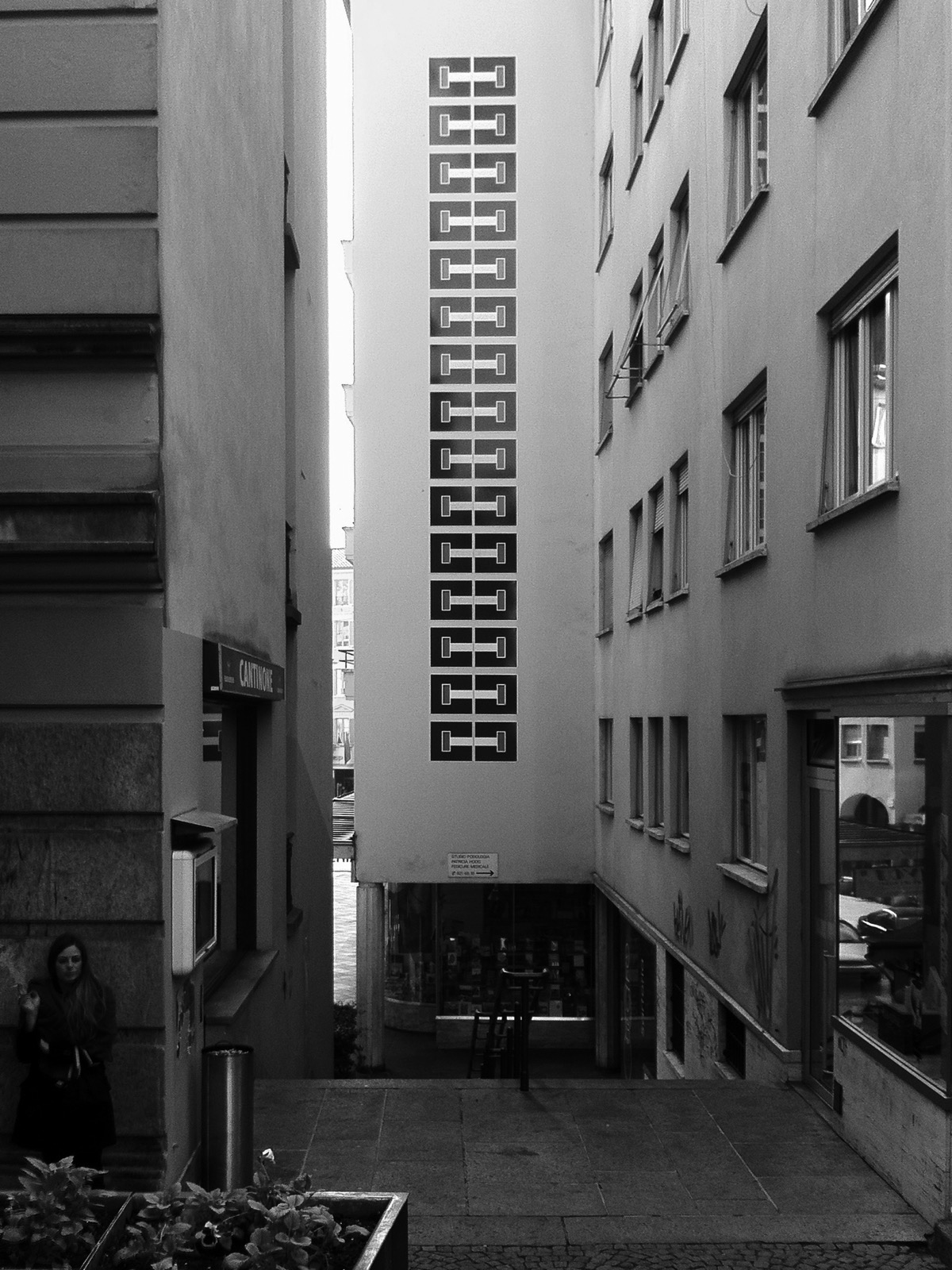
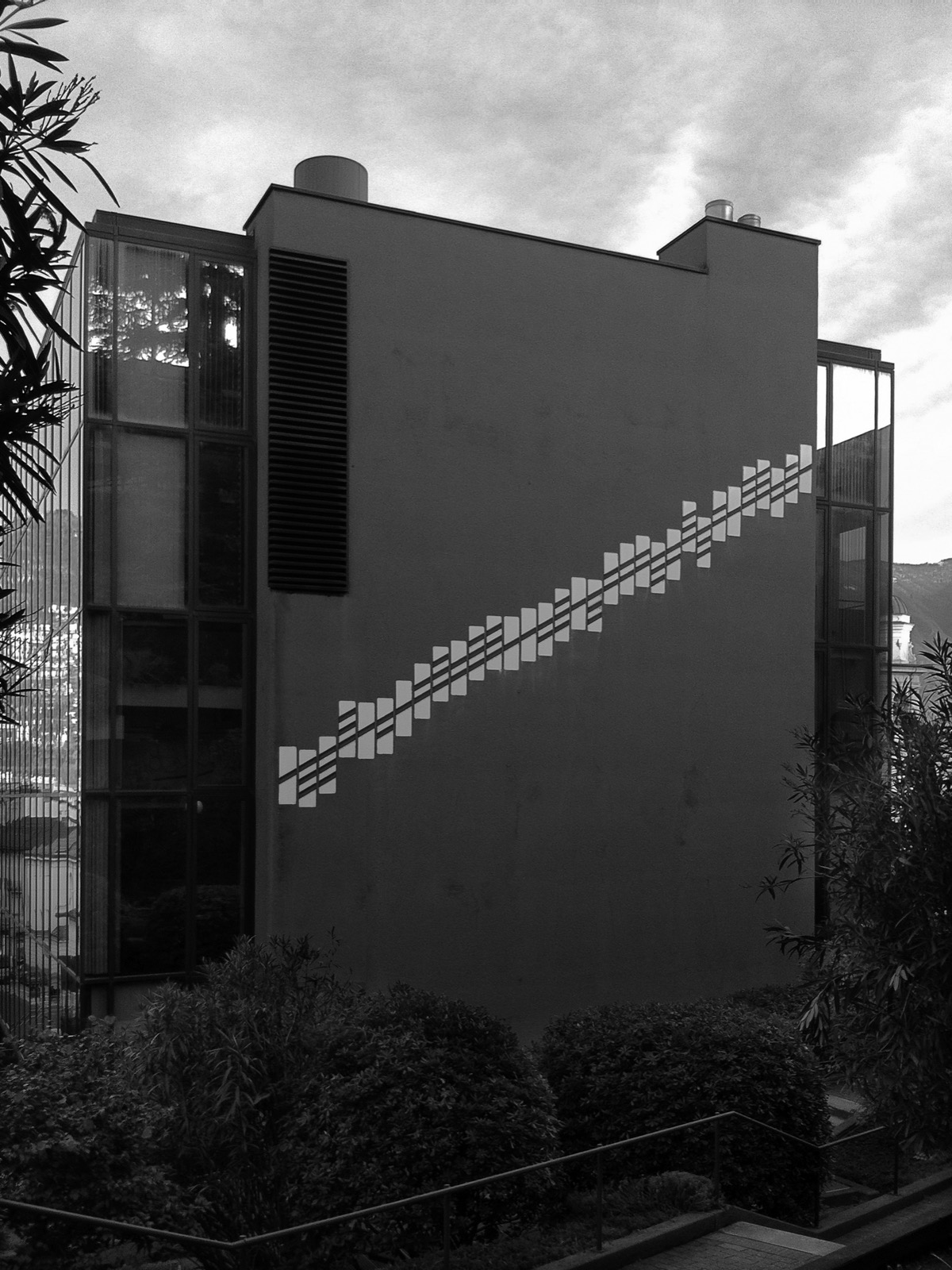
Gysin-Vanetti (Andreas Gysin & Sidi Vanetti) are an artist duo exploring images and patterns using the type geometries of multipurpose displays. What characterises the projects shown here is that their intention is to not modify the layout (or visual organisation) of the chosen hardware – they work with what the existing has to offer. Within these hard constraints they search for infinite visual permutation. Using only prevailing forms, Gysin-Vanetti build images, animations and generate patterns.
Both born in 1975, Andreas and Sidi’s friendship stems back to the University of Applied Sciences and Arts in Ticino where they teamed up for what would be the first of a long-lasting collaboration: a dissertation on visual communication.
“Known to intervene in the public space with an admirable lightness of touch, for instance by converting elements of road signage into a series of perceptive works, the mischievous duo interacts with our sensorial organs and leads us to reexamine our relationship to our surroundings through delicate, playful and inspiring narratives.” – MuDA
The displays they use are designed and meant for multipurpose use. The appeal for the duo (apart from the mechanical aspects) is the ultra low resolution, the circular shape of each dot and the binary palette. They try to understand how to build complex images in these small grids: at times the height is only 14 units or ‘pixels’. All of these displays have one other common characteristic: high contrast, industrial build quality and a quite a long lifespan (and a high price, unless they are bought as “junk”).
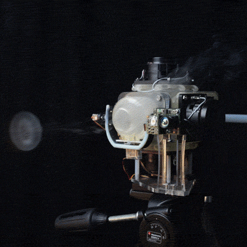
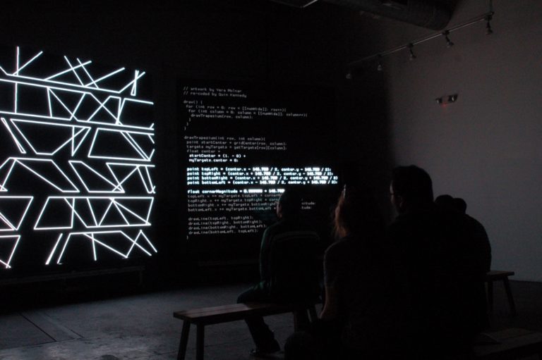
Once the screen is sourced, they build quick and rough programs (usually using Processing) which in part simulates the mechanical displays on a laptop screen. These small programs allow them to work on the compositions while not being around the physical objects or while not knowing the communication protocols yet (hoping that somehow they’ll manage to find a way to interface with them later). These are sketching tools and the main focus is on agility: they must be able to quickly sketch by hand, prototype algorithmic ideas and and easily share the results. Sometimes these programs evolve into “editors”, devised to communicate with the physical displays – to write the data to files or actual code for the embedded systems. At other times the work needs to be done from scratch.
Digits, 2014-2016
42 elements / 1177.5 x 47.3 x 10 cm
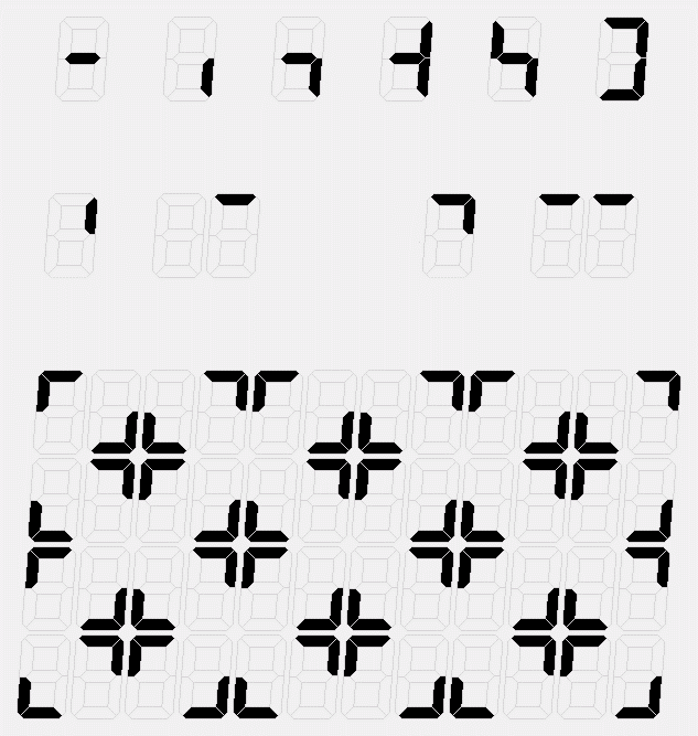
Digits is composed of several electro-mechanical elements called 7-segment displays, which are usually used to display numbers and a limited set of characters. They are used to display petrol prices at gas stations or whenever a numerical display is needed. In the installation the individual blades of each digit are programmed to produce waves of horizontal back and forth motion. Powerful solenoids activate the lightweight blades producing a very intense and ‘heavy’ sound. The elements are white on a black background for maximal contrast and readability without the need to emit light. The whole digit is slightly italic giving each blade a unique and interesting form together with strong ‘industrial’ quality and the lack of any ornament.
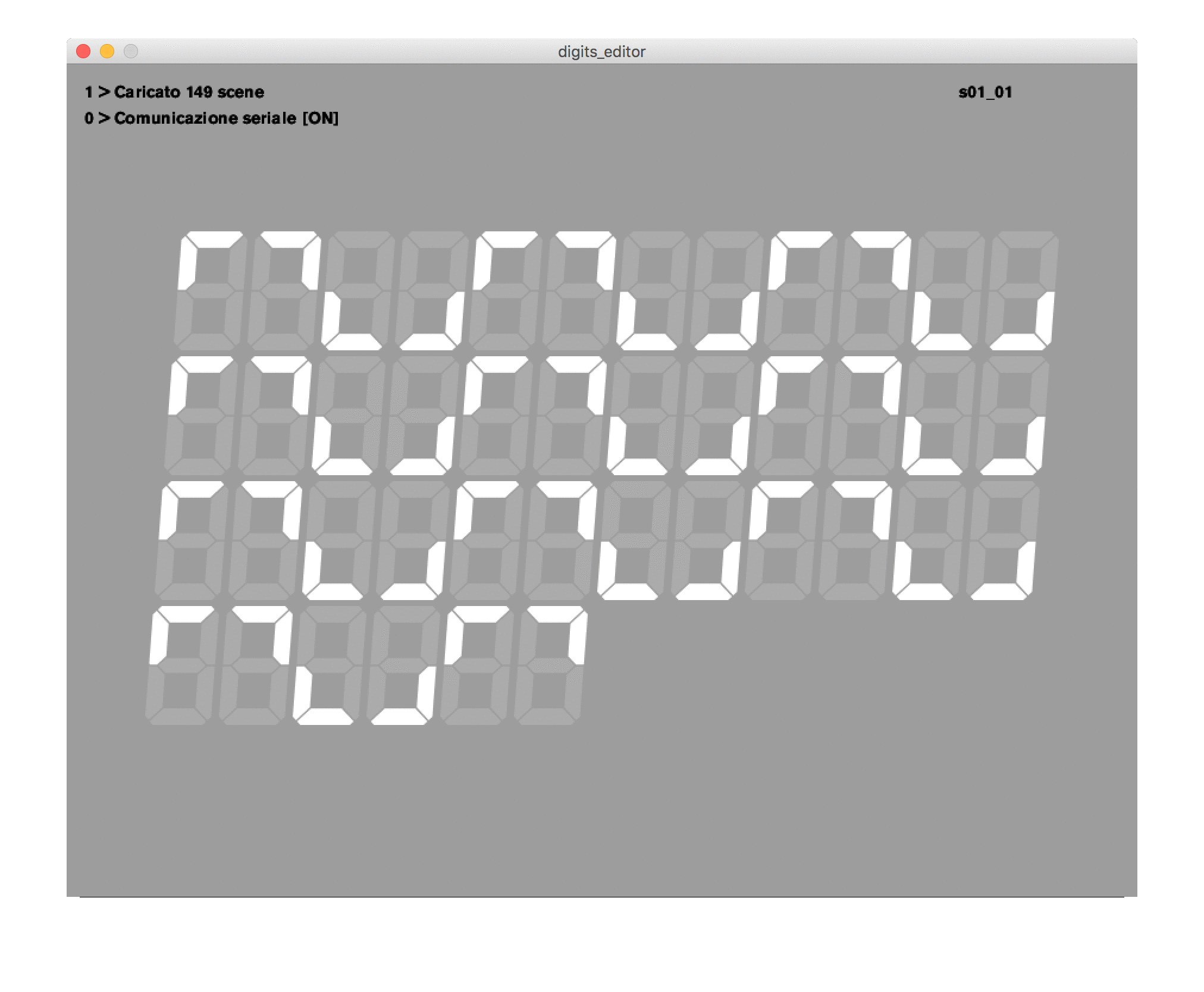
This project exists in two versions which depend on the environment: one with the elements disposed in a horizontal line on the floor, the other in a rectangular shape hung on a wall. In the line version the animation is much faster and louder, more physical. In the wall version the animation is slow and the formal compositions emerge at much slower pace. As in the other projects here the observer is also driven from the natural reading of the forms (mainly digits) to a more abstract language made of unrecognisable forms. With a few perceptual “tricks” (like multiplication, proximity, symmetry) they tried to break the reading and the boundaries of the single element.
For the duo the interesting aspect was the characteristic shape of the seven individual blades. Also: by positioning the elements very closely they were able to melt the boundary of each digit. The result is a display with a slightly tilted orthogonal grid built by somewhat irregular hexagonal polygons.
Carte, 2015
Variable dimension
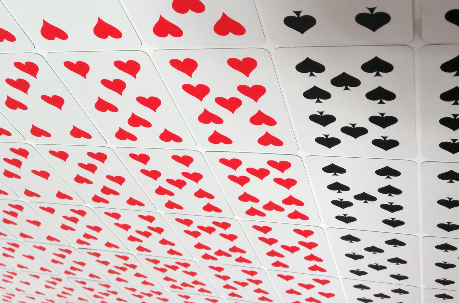


Playing cards offer an unusual grid to display the pips and the suits come in 2 colors.
To build the compositions they built a small application which helped them generate quick previews of algorithmically generated patters. The same application also allowed manual editing for quick mockups of ideas.

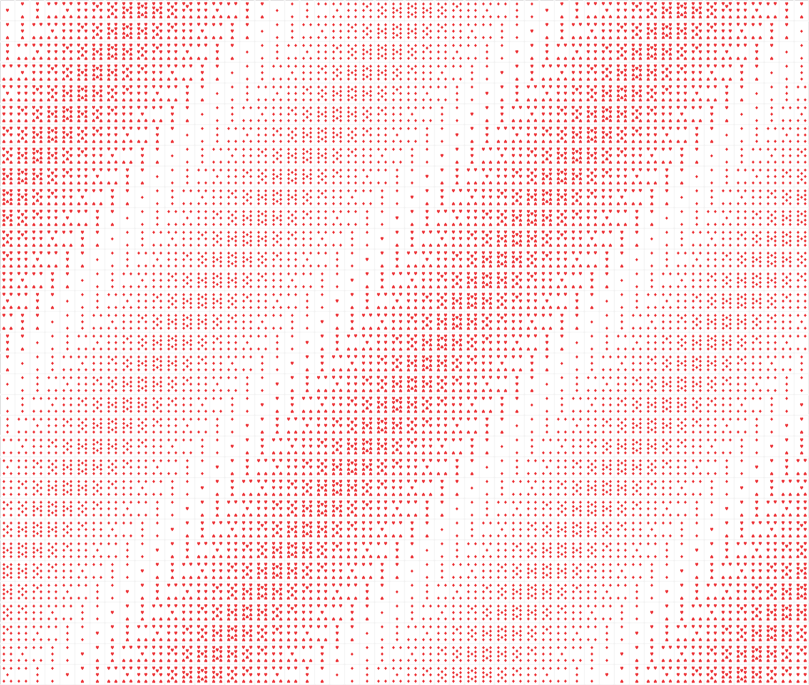
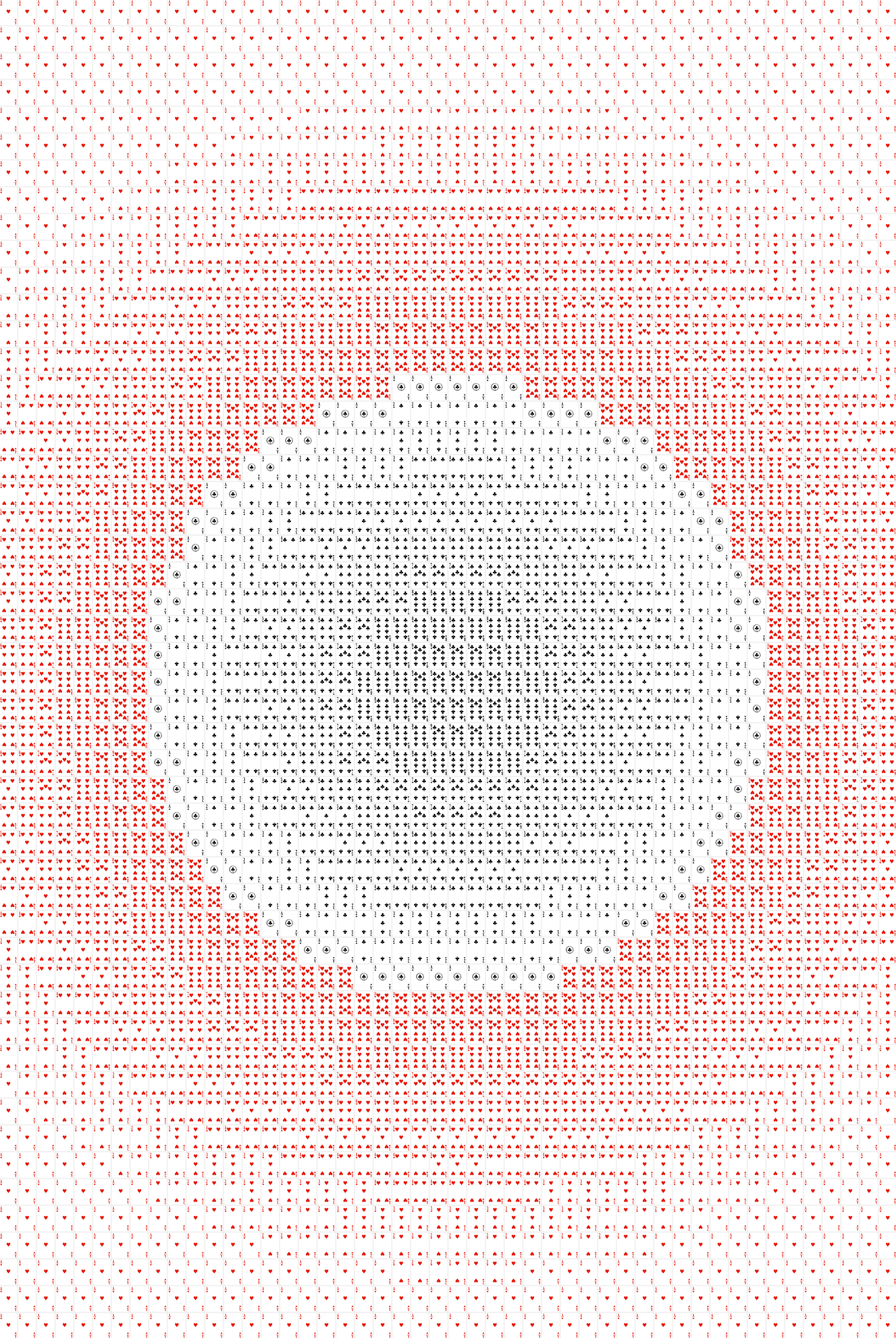
Even thought there is no movement ‘Carte’, Gysin-Vanetti treat the non-kinetic projects in the same way: Carte is just creation of patterns and forms from smaller elements (or “tiles”). They used both a computational and a manual approaches to design the final images. The playing cards are glued directly to the surface.
Neon, 2017
960 cm x 126 cm
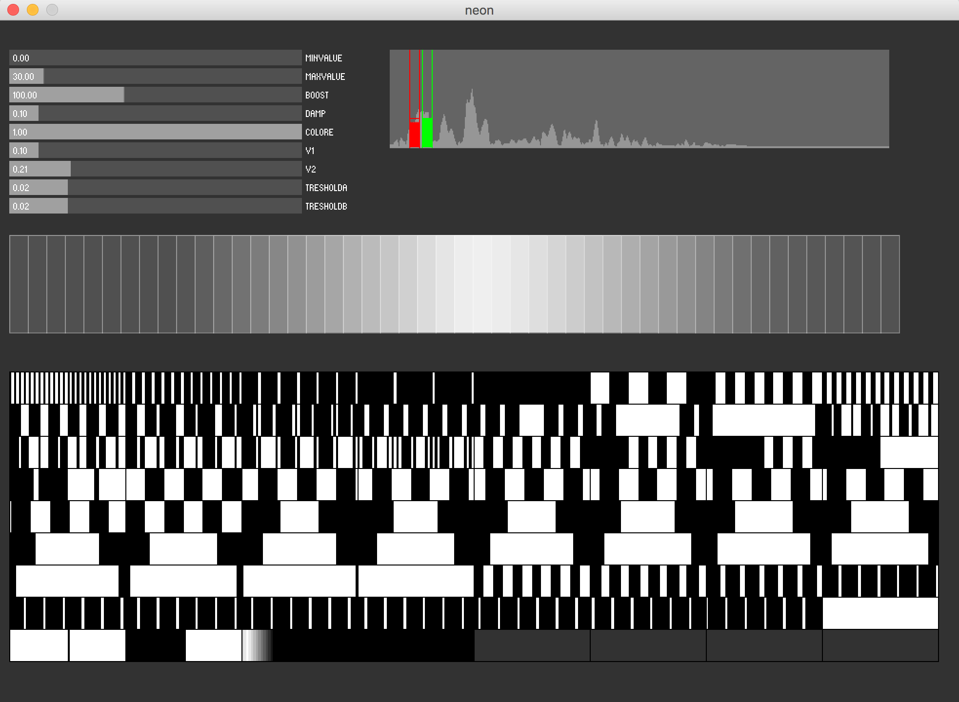
‘Neon’ is constructed from 200 ‘found’ neons, each with a controller to dim them. They are mounted on the standard double tube mount that can be found in many office buildings. After trying several different configurations, the duo settle on erecting a one dimensional display array constructed of 96 tubes since the space to display the project was only 10m wide. The fading speed is not very fast so they concentrated on forms and slow transitions.
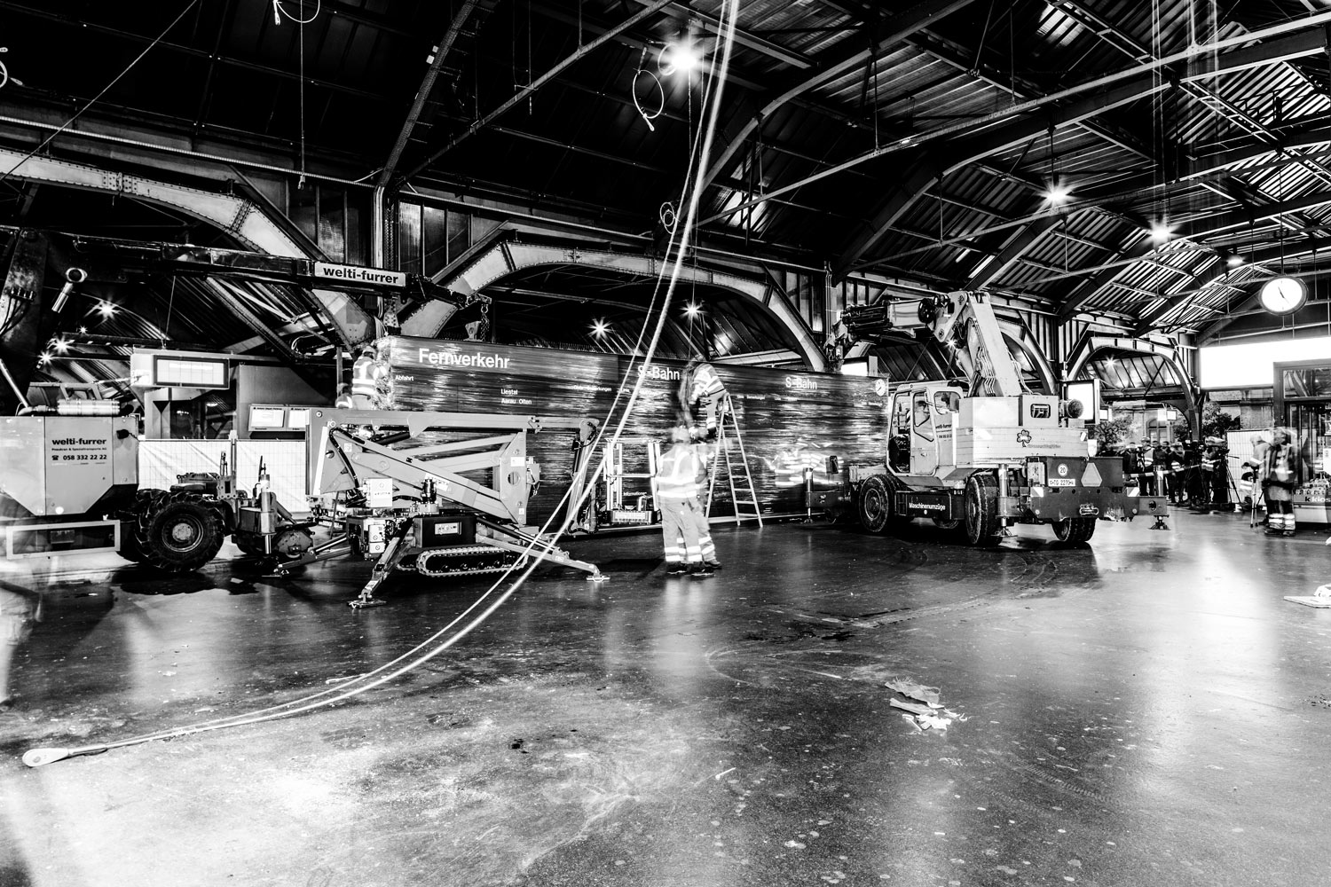
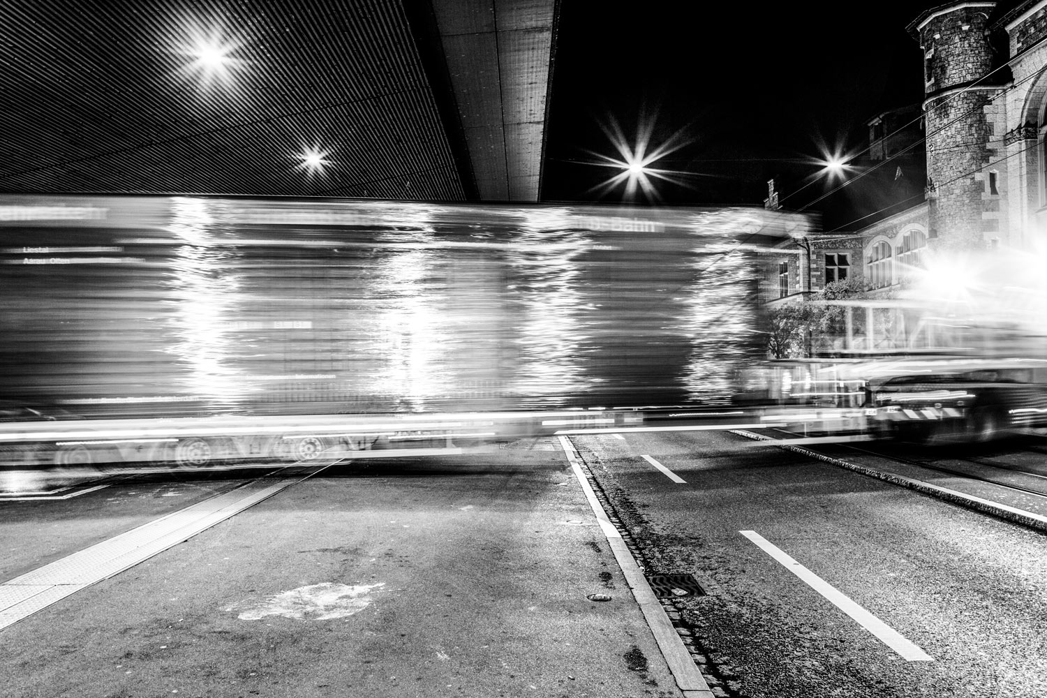
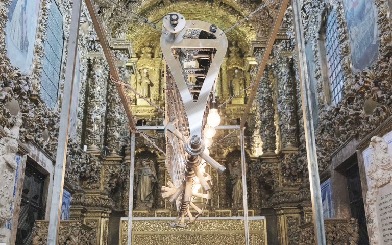
Zürich HB flap, 2016
1380 x 280 x 25 cm
The installation consists in the appropriation and recontextualisation of the original mechanical timetable of the SBB CFF FFS Zürich train station which was replaced at the end of 2015 by a new silent digital model.

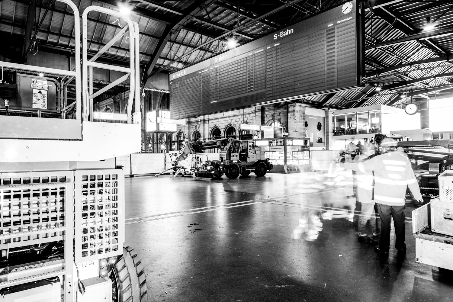
“Since we were kids we were fascinated by this huge and loud display when passing under it in the station of Zürich. We wanted it so badly that in 2006 we managed to build an installation made of the same brands of split-flaps. While working at the first exhibition at the MuDA we learned that he original panel would have been soon removed. It wasn’t hard to convince the curators of the museum to grab it (because the folks at MuDA are crazy) and to re-install it at the museum just in time for the opening.” – Andreas Gysin & Sidi Vanetti
This old display panel is formed by 452 split-flap elements (88 with 40 flaps and 364 with 61 flaps). Each PVC flap is silk-screened with a destination, time or rail informations. In the installation these informations made of words or numbers become abstract moving shapes, forming a bigger composition where the text looses its meaning becoming only form, color and movement. At a regular time interval the configuration of the display starts a long animated transition producing different compositions and sounds.
This was the most “limited” display for Andreas & Sidi: it doesn’t allow to modify letter elements and not even single characters (except in a small area at the bottom, made for custom messages: usually errors) but only full words. Even the sequence of those words is given. Yet the interesting aspect of the original layout is that the displayed text line (train schedules) had to “scroll” from the bottom to the top: so each line possesses the same set of words. This allowed them to create rhythms by repeating the same destinations (or rails) pushing the accent on the form while weakening the meaning of the words.

As a controller for the display they opted for Teensy USB Development boards (most of their projects include these): they are quite fast with enough memory while having a small footprint. A single Teensy (Model 3.2) was enough to drive the whole Zürich GA Flap. Like with all pre-existing equipment, sometime the communication protocols are well documented, but at other times sometimes they start with a blank slate so the only way is to reverse engineer the controllers (with the help of Tino Perucchi).
The ‘Zürich HB Flap’ is currently located in a storage but will soon be transported and displayed publicly in the design school of Zürich (HfGZ).
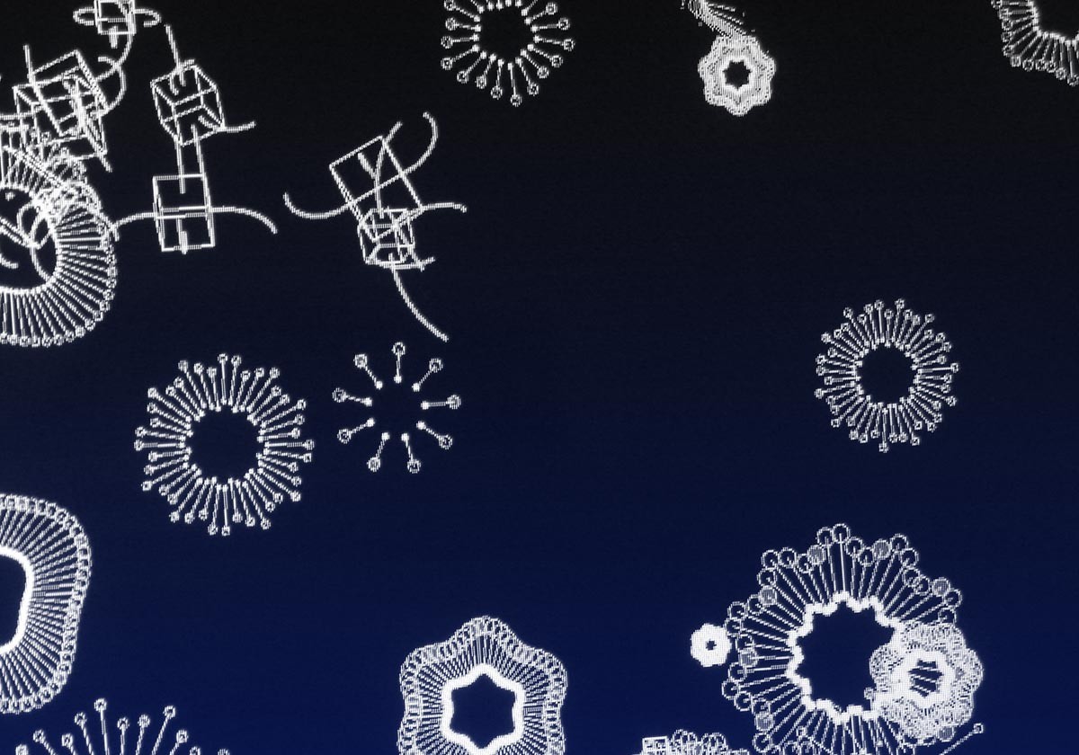
VFD CUU/VFD CUY, 2016-17
21,8 x 8,8 x 6 cm & 14,5 x 8,3 x 6 cm
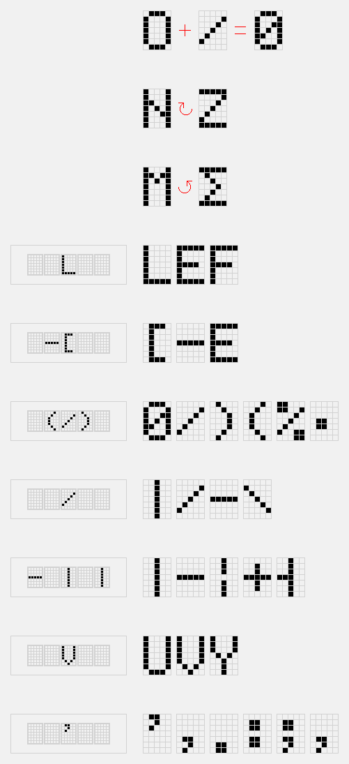
Vacuum fluorescent displays are used since the ’80 in cash registers, auto radios and ovens. Usually they present an alpha-numeric matrix. Each element of the matrix is made of a smaller matrix of dots which can emit light in different brightness. The original limited series of letters and signs typographical of the Latin and Japanese alphabet is used to create a sequence of abstract compositions.
The alphanumeric symbols aren’t read as such but as abstract geometric elements. In the first analysis they examined the formal characteristics of the different signs and symbols composing the character set, discovering a few peculiarities:
1. The symbol for zero can be expressed as the sum of the capital ‘O’ combined with a slash.
2. The uppercase ‘N’ and ‘Z’ are similar if rotated by 90 degrees and stretched to the cell size. The same applies to the letter ‘N’ and Sigma.
3. ‘L’,‘E’ and ‘F’ have a common denominator (formally).
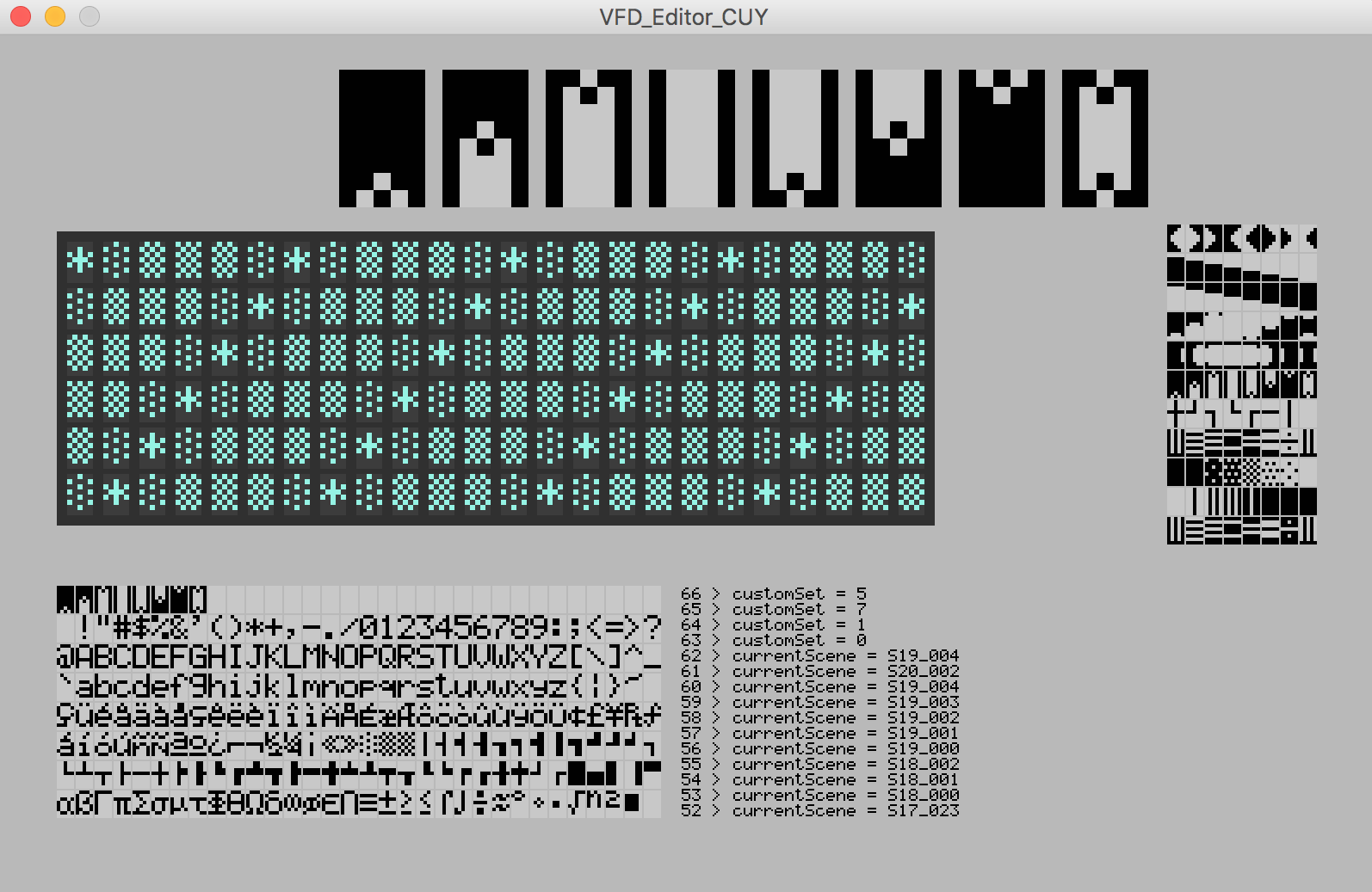
Those and other features are then used to produce animated sequences and patterns, like the examples illustrated in 4. to 10. Transitions from scene to scene is accomplished in several ways: procedures take care of morphing a composition into another. The compositions are built on two levels of detail: a macro image (on composition level) and a small pattern (on character level). In some transitions they keep the macro level intact. In the CUY version a third level is present as the display allows to change the brightness per each character.
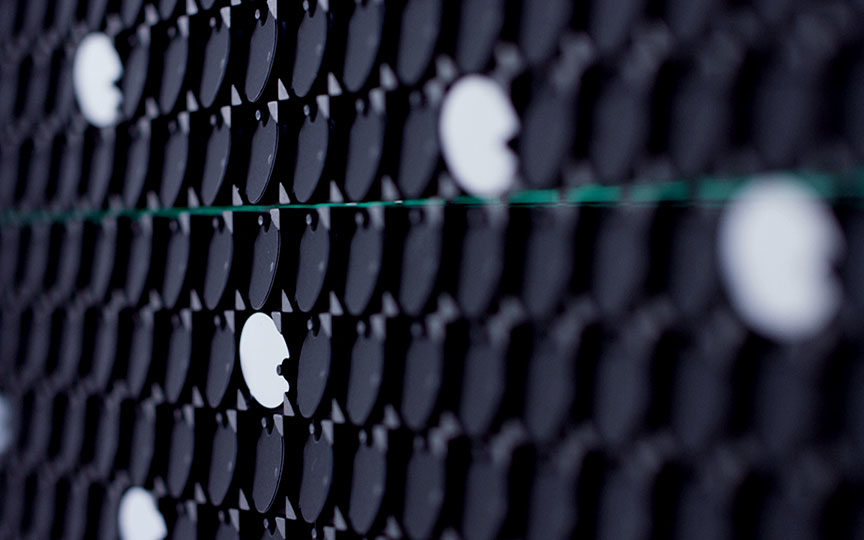
Dots 2 & Dots 3, 2016
121.8 x 21.8 x 10.5
These flip-dots displays are usually mounted on buses to display the destination stop. Tiny magnetic bi-colored circles flip when the underlying solenoid is activated. This quick mechanical action produces a tiny sound. These two elements are custom built based on a previous prototype coming from an old bus display (Dot 1, 2010-11) which was reverse engineered (with the support of Tino Perucchi) and reprogrammed. They decided to maintain the original elongated form factor (from the bus) in the newly built displays.

A series of patterns build on the underling low resolution grid are displayed in sequence with pauses of different lengths. In one version the resulting geometry is built on an orthogonal grid while on the other one the grid is oblique.

Dots 2 and 3 are custom built panels but they wanted to keep the horizontal shape of our first prototype display (Dots 1). For these two versions they built the compositions on top of the grid grid of dots – giving weight once to the orthogonal aspect of the raster and once to the diagonal one. The kinetic aspect is used to generate transitions and rhythms on top of the forms; an extra layer.
For more information and past projects see Gysin-Vanetti website. The catalogue of their work was also released as a mobile app, and can be downloaded here → iOS / Android. The app is the virtual counterpart to the physical exhibition in Zurich and explores the process of the exhibition-making, the thoughts of the two artists, and documents each installation presented in the MuDA.

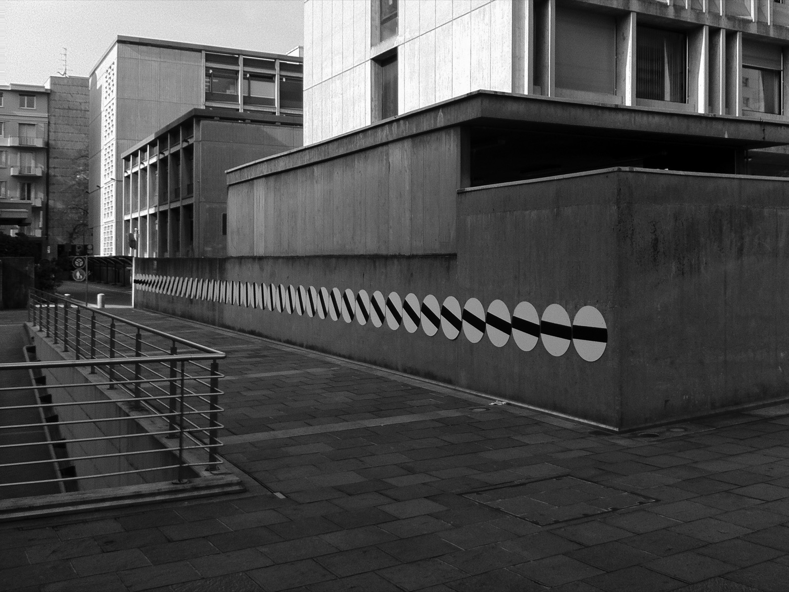
↑ In the past Gysin-Vanetti also used other materials with a strong formal characteristic – for example horse jumping obstacles and street signs (see above).
/++

/++