
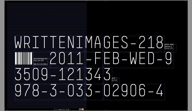
Offset duotone printing, finished with perforations. Concept and embroidery by Masaki Komoto, design by Yuri Sato. Limited editions of 300.

Activity Log
Join our Community to View/Add Comments.
Title
Excerpt
Metadata
Color

Written Images: Book Launch + Giveaway
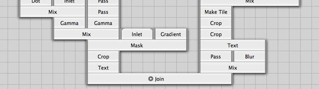
Created in collaboration with more than 70 media artists and developers from across the world, Written Images is the first of its kind. A ‘programmed book’, continuously regenerated for the digital printing process, offering each reader a unique e...

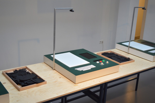
Longhand Publishers – Design workstations for collaborative mini publications
In the former building of the Newspaper BN De Stem, the installation created by Tim Knapen & indianen, allows visitors to collaboratively create mini publications.
